Tuesday 25 February 2014


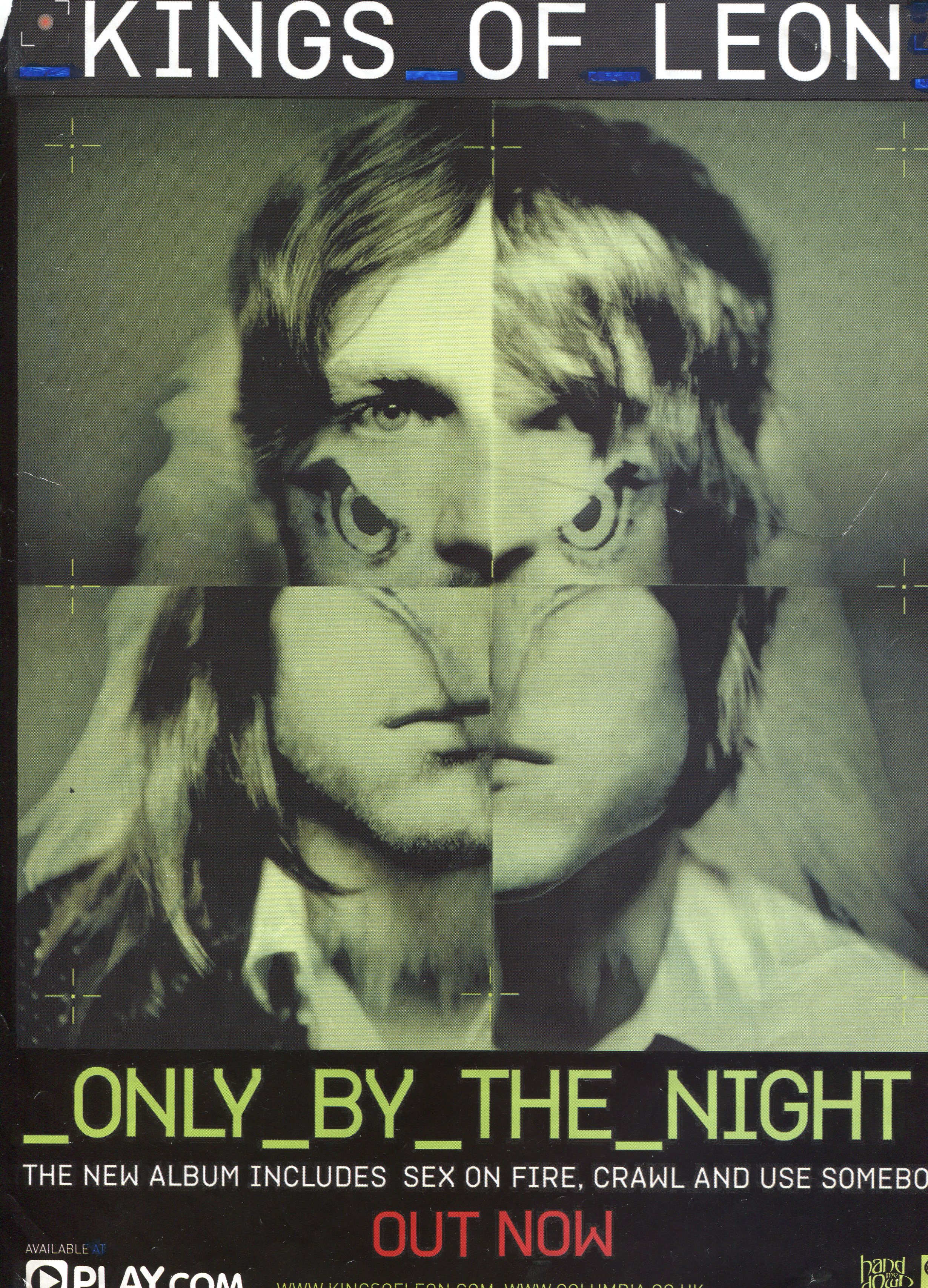
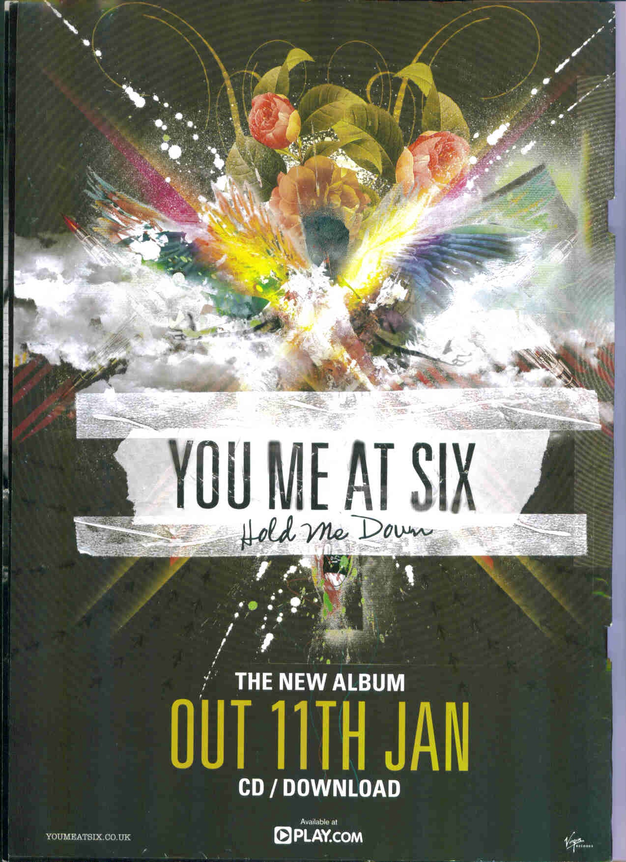
General conventions of Album Adverts:
-Artist name - this is usually the biggest text on the whole page. It's what the audience already know and is therefore used to draw their attention.
-Album name - usually the second biggest text on the page as it's classed as the second most important. The audience need to know what it is the artist is advertisement
-Date of Release - the next crucial information is when the product is due for release. This is likely to be larger than any remaining text as the audience need to know when the album is available so they can purchase it.
-Main image - the image is a dominant part of the magazine as it's what is used to catch the eye of the audience. More than often it will be the artist themselves.

These factors are vitally important to include in my own poster as they are conventions used on ALL album advertisements. There inclusion will therefore help in making my own work look like an actual media text.

Other ideas which I may want to pass onto my own text are as follows:

Sometimes artists use pull quotes from various sources, this gives the audience the chance to read a review from a third party without having to research it themselves. This can be a very effective technique as only positive reviews are used and a biased opinion is created which may be a big factor in encouraging the audience to buy the album themselves.

Main Image - Link between CD and Poster


-Main image from CD cover used directly as main image on album advert. Provides instant promotion as the audience know exactly what it is they should be looking for in store. This technique can be seen on You Me at Six's 'Hold Me Down' and Kings of Leon's 'Only By The Night' advertisements.

-In other cases the decision may be taken to differ the main image from the album cover. In such case it's likely the advert will simply opt for an alternative picture of the artist themselves. This technique can be seen on Mumford & Sons 'Sigh No More' and Ed Sheeran's '+' advertisements.

-If the decision is made to use a different main image on the advert oppose to that used on the album cover then it may be the case that the front cover of the album is displayed in the lower hand corner of the poster. This gives the audience the chance to see what it is they'll be looking for as well as allowing for an alternative main image to be used. This technique can be seen on Adele's '21' and Coldplay's 'X & Y' advertisements.

Sunday 23 February 2014

Existing Bastille Album/EP Covers


More specifically I've gathered some album and EP covers from the band whose song I am using, Bastille, in order to seek inspiration and ideas linking directly to their songs. In terms of the main images I found they have mainly focused on the surroundings rather than the actual people within shot. Besides 'Flaws' there is no human face within the shot despite people being used in 4 of the 6 album images. This links with the ideas portrayed on the Kodaline and Imagine Dragons album (previous post) by using models but not making them the main focus. There are a number of conventional themes that Bastille have carried throughout some of their front covers. Firstly the low lighting and dull colours, often linked with alternative rock music videos, are a constant hint to the type of music to expect on the albums. A common theme on the EPs is the structure of the words and the way they cross over one another. This may be something I experiment with on some of my drafts. Though I'm creating my own artist I do want to take a piece of Bastille into my own work and have decided to do this using the triangle technique to represent A. This is Bastille's trademark and is ever present on all digipak covers I hope this is something I'm able to carry through to my final draft.

Alternative Rock - Album Cover Ideas


Arctic Monkeys


The first noticeable aspect of the digipak is it's lack of colour. It sticks to the stereotypes of the alternative rock genre by using dark/dull colours (black and white). This perhaps connotates to the audience the seriousness of the music. It holds meaning and isn't produced just for the recreational aspect. Another reoccurring theme of the digipak is the use of cigarettes. These can be seen scattered across the CD itself as well as in the main images on the cover and back of the album, This once again links to the seriousness of the album as well as the rebellion of the band itself. Smoking is seen as a negative thing to do but they don't care and make it a pivotal part of their digipak. This clear continuity throughout is a clear convention of digipaks in general. Once a theme is chosen it is conveyed on the outer case as well as the interior. Another convention of digipaks the Artic Monkeys stick too is the placement of their band name on the front cover of their album this alows the audience to clearly see who the album is by as soon as they view the face of the digipak. It is made to stand out further by being placed upon a white background oppose to the surrounding darker backdrop. However, as well as portraying certain conventions AM stick to their renound rebelions and break convetions. Most noticably they don't include the album title 'Whatever People Say I Am, That's What I'm Not' on the front of their digipak. Instead the title is placed, in small font, on the spine of the pak. This perhaps highlights the arrogance of the band, suggesting their name is the most important thing.


Monday 3 February 2014

Conventions of Album Covers


1. Main image of the Artist
2. Artist name clearly visable, usually a different colour to album name 
3. Album name also clearly visable in an alternative colour
4.Usually no more or limited text to draw audiences focus to the most impotant things (artist name & album title)
5. Simple colour scheme and simplistic design