Sunday, 23 February 2014

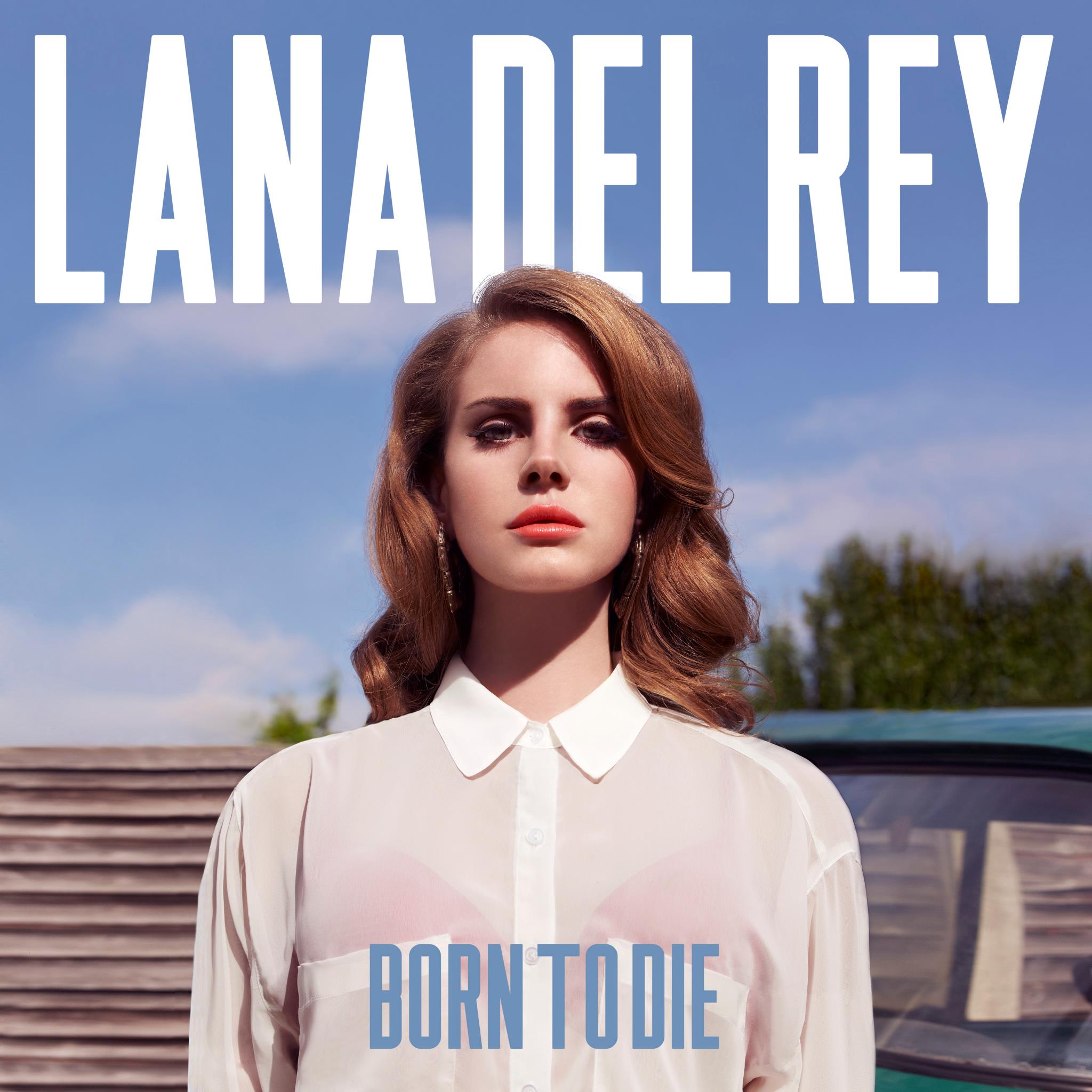
Alternative Rock - Album Cover Ideas


Arctic Monkeys


The first noticeable aspect of the digipak is it's lack of colour. It sticks to the stereotypes of the alternative rock genre by using dark/dull colours (black and white). This perhaps connotates to the audience the seriousness of the music. It holds meaning and isn't produced just for the recreational aspect. Another reoccurring theme of the digipak is the use of cigarettes. These can be seen scattered across the CD itself as well as in the main images on the cover and back of the album, This once again links to the seriousness of the album as well as the rebellion of the band itself. Smoking is seen as a negative thing to do but they don't care and make it a pivotal part of their digipak. This clear continuity throughout is a clear convention of digipaks in general. Once a theme is chosen it is conveyed on the outer case as well as the interior. Another convention of digipaks the Artic Monkeys stick too is the placement of their band name on the front cover of their album this alows the audience to clearly see who the album is by as soon as they view the face of the digipak. It is made to stand out further by being placed upon a white background oppose to the surrounding darker backdrop. However, as well as portraying certain conventions AM stick to their renound rebelions and break convetions. Most noticably they don't include the album title 'Whatever People Say I Am, That's What I'm Not' on the front of their digipak. Instead the title is placed, in small font, on the spine of the pak. This perhaps highlights the arrogance of the band, suggesting their name is the most important thing.


Monday, 3 February 2014

Conventions of Album Covers


1. Main image of the Artist
2. Artist name clearly visable, usually a different colour to album name 
3. Album name also clearly visable in an alternative colour
4.Usually no more or limited text to draw audiences focus to the most impotant things (artist name & album title)
5. Simple colour scheme and simplistic design

Wednesday, 15 January 2014

Joseph Klapper - Selective Filter Model

Klapper's basic belief is that a media texts can only have an impact upon an audience once it's undertake 3 stages. This idea ensure that the audience have an active role in translating a media text in order to understand it's message and the effect that it has on them


The 3 stages are as follows...

1.       Exposure
The first stage focuses on the first choice. An audience is able to choose which types of media they are exposed to, they only consume what they want to. The choice to expose yourself to certain media texts is usually down to an individuals interests, education, work commitments etc. A media text is ineffective if no one see's or hear's it
.
2.       Perception
The audience then have another choice to make. They must decide whether they accept the message being conveyed or reject it. It's not always the case that an audience will accept what's being transmitted to them. Often audiences take notice of certain media texts but ignore others.

3.       Retention
It's then down to the audience to retain the information in order for it to have any effect on them. The messages have to ‘stick’ in the mind of those who have accessed the media content.

To Conclude, for a media text to have it's desired effect it relies a lot on audience attuitudes towards the text. If they don't like it they will simply ignore and even if they do agree the creaters must still rely on them to retain the message.
This theory can be applied to my work in the following ways...

Firstly, the audience must actually choose whether they want to expose themselves to my music video. They will then perceive the messages within the video in different ways. Some they may accept and reject others. An example group of people who may dislike my video message are those who like to drink alcohol as they see the negative impact it can have (suicidal thoughts). Those who do accept it though will gain the message that if in any state of depression alcohol isn't the answer. My video is a subtle message again drinking alcohol as it shows the situation it can leave you in. It's then up to the audience to retain this message.

Monday, 2 December 2013

Mise-en-Scene

Costume
  • Vest
  • Shorts
  • Socks
  • Black Jeans
  • Denim Jacket
  • Grey tee
  • Old Trainers
Props
  • Bed
  • Dovet
  • Pillow
  • Set of Drawers
  • Loose socks/boxers
  • Empty cans
  • Litter
  • Picture of couple
  • Mobile phone
  • Paper cup
  • Swings
Location
  • Bedroom
  • Doorway of house
  • Living Room
  • Kitchen
  • Street
  • Park
  • 'Cliff'