The reason I chose this image was to reflect the story of the video. It promotes both the music video and the album itself. The audience is able to guess at what the hidden story is behind the main song before seeing the video or even hearing the sing. The idea of using a main image directly reflective of the music video is a technique used by a number of artist. An example of this would be Katy Perry's 'Teenage Dream'
After choosing the main image I wished to use i could then turn to Photoshop in order to create an album cover from the image. Firstly I was required to crop the image into a conventional squared shape in order to create the album effect.
After this i could begin to add my desired text to the image. The style I decided on was fairly simple for my first draft and followed the structures of existing Bastille album covers by using the crossword technique (seen below).
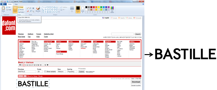
However, despite the simplistic designs of these album covers the actual creation was a lot more difficult then I had first anticipated. The first step I took was to insert the name of the artist. This, however, was not as simple as typing the text onto the Photoshop program. Instead I decided on a font upon www.dafont.com. Dafont is a website full of many different font designs, from fancy to techno styles. The font I chose was within the 'basic' category in order to stick to the fairly simplistic font styles used throughout the alternative rock genre. The font was called Ethon and can be seen below:
From here i could then use the print screen function to paste it into the paint program and crop so only the word was visable and could, therefore, be entered directly onto my album cover.
After pasting the text onto my album cover I was required to remove the white background using the 'Magic Erase' tool.
In order to make the text stand out against the dark background I decided to change the colour of the text from black to white using the paint bucket tool. As well as this I also placed the test where it would fit in with the crossword structure. I also decided to stick with further conventions of Bastille by replacing the A within the bands name with a triangle.
After this I used the same font (Ethon) to insert the individual letters enabling me to create the cross word effect between Icarus and Bastille and eventually arriving at my first draft...


No comments:
Post a Comment